Have you ever noticed that the more options you have, the longer it takes you to decide? If so, you've experienced Hick's Law in action. If you're scratching your head wondering, "What is Hick's Law, and how can I apply it?" you're not alone.  The great news is that you can easily apply Hick's Law to user experience to enhance your website's functionality. In this post, we'll walk you through how.

What is Hick's Law?
Hick's Law describes how long it takes for a person to decide due to the choices they are presented with. According to this law, the more options you have, the longer it will take you to decide.
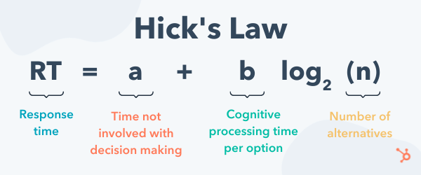
Short for the Hick–Hyman Law, this principle was named after British and American psychologists William Edmund Hick and Ray Hyman. In their quest to comprehend the relationship between the number of stimuli and an individual's reaction to any given stimulus, they created an equation: RT = a + b log2 (n)
Let's break this equation down:
-
RT = reaction time
-
a = the time that is not involved with decision-making
-
b = an empirically derived constant based on the time it takes to process each option cognitively (Psst: It's approximately 0.155 seconds for humans.)
-
log2 = logarithm function
-
(n) = the number of equally probable alternatives
So say your phone starts playing a sound. It takes three seconds to detect that the sound is an alarm you set. So a = 3. Because you're human, b = 0.155 sec. You have four buttons to turn off the alarm: Snooze, Stop, the home button, and the power button. So n = 4. Let's plug these numbers into the equation to solve for response time.
The time to respond would be RT = (3 sec) + (0.155 sec)(log2 (4)) = 3.31 sec.
But what if there were eight buttons to turn off the alarm instead of four? Then the time to respond would increase to 4.31 sec. Now consider if there were 12, 20, or 40 buttons. The time to respond would continue to grow logarithmically. (Safe to say, it's a good thing alarms only have four buttons.)
And that is where information overload comes into the picture. When you have too much information or options to consider, making a decision becomes increasingly difficult. When you reach that point of information overload, it's more likely a person will make a poor decision — or one they're unhappy with.
What is a Hick's Law Example?
Think back to the last time you made a purchase. Maybe you bought a stroller for your child or a takeout order. Or maybe you bought some new shoes or a coffee machine. Let's say you're buying a coffee maker.
You go to Target's website and navigate to 'Kitchen Appliances.' From there, you scroll to 'Coffee Makers.' And once you arrive there, you're bombarded with options. Espresso machines. Multi-function coffee appliances. Single-serve machines. French presses. Automatic drip coffee makers. And once you decide which type you want, the decisions don't stop there. Then, it's time to determine which brand is the right fit for you.
At first, landing on this page might feel exciting. There are so many options, so you're bound to find the perfect one — right? But the more you shop, the less ready you feel to click 'add to cart,' much less checkout. What if the coffee maker you pick is too loud? What if it's more challenging to use than expected? What if it doesn't match your other kitchen appliances? What if you buy an espresso machine and wish you got a simple drip coffee maker? The questions can feel overwhelming.
This isn't just a case of indecisiveness. Hick's Law states that when people are presented with more options, they take longer to make a decision. As you may have guessed, you can apply this to other situations aside from buying a coffee maker. Below we'll take a closer look at this law and how it applies to user experience (UX) design.
What is Hick's Law in User Experience?
By applying the practices of Hick's Law, you can easily craft a better user experience for your website, app, pop-up form, smartphone, remote control, oven — the options are endless.
We know that when users are presented with too many options, it spells trouble for decision making. So if your website has too many options, they might get frustrated and quit using it. Or, they might select an option you don't want, such as exiting out of a form before filling it out, unsubscribing from a newsletter, or even abandoning their cart. But if they're presented with fewer options, they're more likely to make a decision — or, at least, enjoy their experience.
UX designers may use Hick's Law to simplify their navigation menus, forms, terms of service, and anything else that requires users to make relatively simple decisions. Let's take a closer look at some of these applications below.
Navigation Menus
Whether you're creating a navigation menu for a website, app, or other product, having too many options confuses and frustrates visitors. (And yes, the same goes for restaurant menus!)
Forms
Chances are you have at least one form on your website. Perhaps it's a contact form, newsletter opt-in, or even an account registration. Regardless of what it achieves, it's crucial you limit the number of options as much as you can. When you require your site visitors to fill out too many fields or click too many buttons, they can abandon the form and bounce from your site altogether.
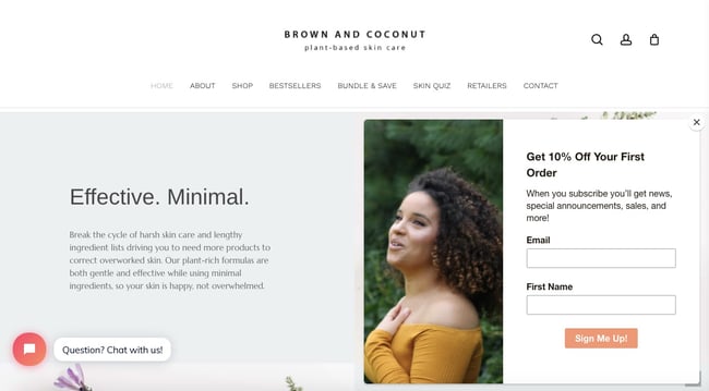
For example, take a look at skincare brand Brown and Coconut, which provides a great example of an email sign-up form implementing Hick's Law. The user has two clear options: Sign up for emails or exit the form. If they choose to complete the form, they only have to fill in two fields.
Terms of Service
Terms of service agreements are lengthy — and for good reason. But because of the length and breadth, it's essential you give users and customers different options to review them, especially if they're signing a contract or paying money.
Pricing Pages
Another place where businesses fall victim to information overload is with pricing pages. In an effort to provide different options to encourage buying, you can inadvertently make it harder to decide, and, therefore to buy. Offering filter options that allow prospects to filter according to the price point they want or the product they want can help prevent information overload.
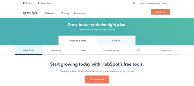
HubSpot, for example, doesn't list the prices of all its products on one page. Instead, it allows users to click on the specific product tab they are interested in buying.
Homepages
Because your homepage sets the tone for the rest of your user's interactions with your website or app, it's especially crucial you build it with Hick's Law in mind. If the first thing they experience is a cluttered homepage with disorganized modules, an overabundance of images, and slow-loading images, it's off-putting.
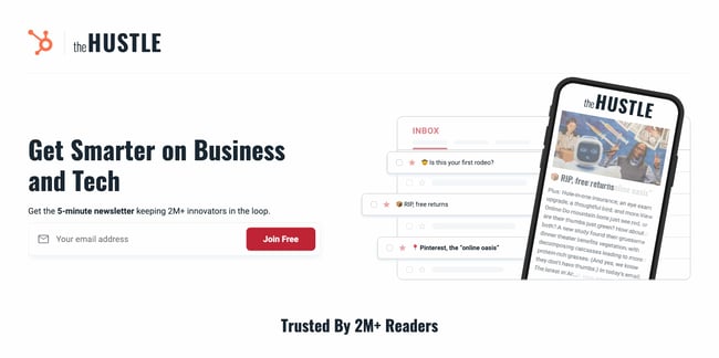
The Hustle's homepage is a great example of Hick's Law in action. The reader only has a few options: Subscribe to the newsletter, scroll down to read through readers' testimonials, or click their Terms and Privacy Policy.
How to Implement Hick’s Law
Here's the great news: You do not need to be a UX designer to implement Hick's Law on your site, app, or product. By following these (relatively simple) steps, you can make it easier — and more efficient — for users to make decisions on your website.
1. Reduce the options for time-critical tasks.
The guiding principle of Hick's Law can be summarized in three words: Less is faster. In other words, by providing only the most essential options, you can speed up a user's response time.
Take Clarke's Cakes & Cookies for example. To speed up the user's checkout process, the website provides an option to "Add to Cart" when a user hovers over a menu item.

2. Break down complex processes into smaller steps.
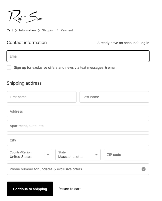
Another way to implement Hick's Law on your site is to break down complex processes — like the checkout process — into smaller steps. You can allow users to view and edit their cart on one page. Then input their shipping info on the next page, and their payment information on the next. Riot Swim breaks down the checkout process in this way.
3. Highlight recommended options.
To reduce the time it takes a user to make a decision, you can highlight or prioritize a recommended option in your design.
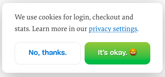
Consider Smashing Magazine's cookie consent form, for example. The user has three options: Accept the cookies, don't accept, or learn more about the magazine's privacy settings. The recommended option — accepting the cookies — is highlighted with a pop of color and emoji.
Apply Hick’s Law to Your Designs
There are hundreds of web design rules and best practices to follow. But most of them boil down to one common thread: Don’t complicate your users’ already overcomplicated lives.
Editor's note: This post was originally published in October 2018 and has been updated for comprehensiveness.


