Designing the perfect restaurant website is like crafting the perfect dish. With both, you’re balancing style and substance. Your dish should look delicious, but that only gets you so far if it doesn’t actually taste good.

It’s the same deal with website design: Your website should pack just enough visual flair to hold visitors’ attention while helping them easily achieve their goals, whether it’s booking a reservation, reading the menu, placing an order, or deciding why they should choose you for dinner over the bistro around the corner.
Nobody wants to lose to the other bistro on the block, which is why we’ve compiled 22 of the best restaurant website examples that look delectable and, more importantly, book more reservations. In this, post, we'll also walk through how to design a successful restaurant website yourself.
Best Restaurant Website Examples
- Urbanbelly
- Pujol
- Punkt
- Bon Bouquet Café
- Barra
- Canlis
- Lucky Folks
- Flaner
- Back Door Donuts
- Disco Cheetah
- Septime
- Abnormal Co.
- The Clove Club
- Pizzeria Vetri
- Sweetgreen
- Hisa Franko
- Frantzén
- Laurie Raphaël
- Sublime Doughnuts
- Adachi
- Rosebud
- Pastaria
1. Urbanbelly
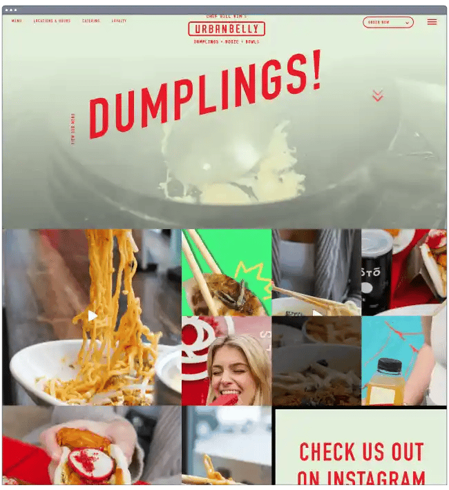
What we like: Based out of Chicago, Illinois, Urbanbelly is an Asian fusion restaurant whose website makes clear exactly what it does best. Once you land on the home page, you’re immersed in the kitchen as dumplings and bowls are being prepared in full-screen video.
These videos, paired with minimal but contrasting overlaid text and unique graphics, expertly convey the restaurant’s playful feel and invite visitors to visit or order delivery. There’s a social media element as well, an Instagram feed at the bottom of the page.
2. Pujol
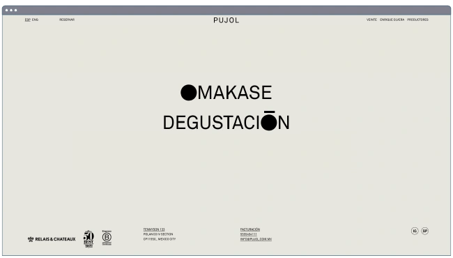
What we like: The acclaimed Pujol restaurant is a showcase of Mexican gastronomy with a simple but effective website. A clay-green background, grayscale images, and whitespace conjure a modern and elegant feel throughout.
As for content, Pujol’s site gives you the essentials — its menus, location, and reservation links. The website also recently added a plug for head chef Enrique Olvera’s book, which admittedly breaks the flow of the site. Still, we’ve seen few restaurant websites that can create a mood like this one.
3. Punkt
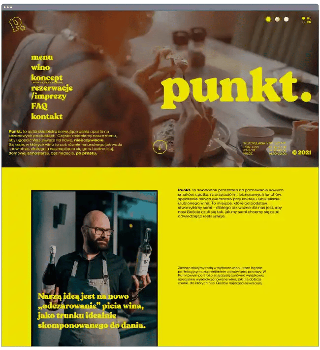
What we like: Going in the opposite direction, Punkt (Polish for “point”) is a bistro with a website that conveys vibrancy and variety. We love our full-screen videos, and this website serves one up right from the start. But, instead of honing in on the cuisine, it also captures Punkt’s dining space and atmosphere.
As you scroll downward, you can read more about the restaurant’s approach to food and wine, the overall concept, and its event services. At the top of the page, you can even change the whole color scheme — something we haven’t seen anywhere else.
4. Bon Bouquet Café
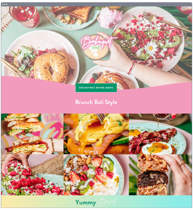
What we like: Brunch may combine breakfast and lunch, but we think it can be enjoyed any time of day. The famous Bon Bouquet Café in Paris seems to agree.
This website turns the color up to the max, starting with a neon sign atop the vibrant hero image. There’s no denying the playfulness of the visuals here. And in a city not known as a particularly tropical destination, Bon Bouquet Café’s website makes you crave a pineapple mojito paired with eggs Benedict.
5. Barra
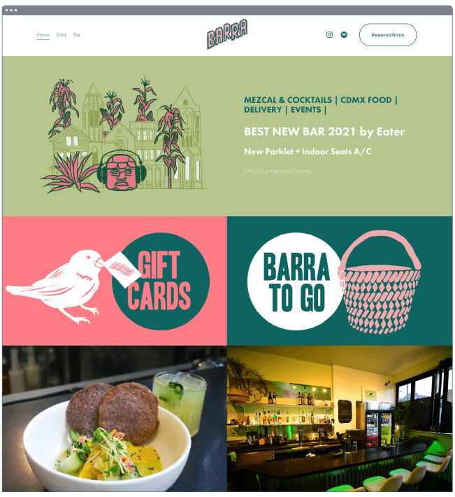
What we like: Barra’s website is a masterclass in color schemes. Not afraid of a simple tiled layout, this restaurant’s home page churns out something unique. An pleasing color palette and custom illustrations complement the restaurant’s cuisine: tacos and Mexican small plates.
Like other examples here, Barra doesn’t try to overwhelm — the navigation is clearly laid out, with every option obvious. Whether you’re looking for takeout, gift cards, reservations, or just where to find the place, all it takes is a quick scroll and a click to get there.
6. Canlis
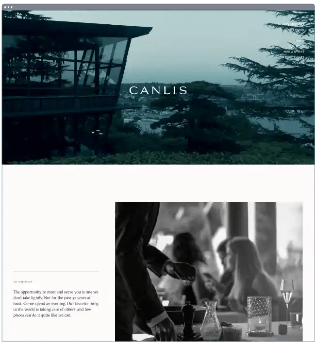
What we like: At first glance, the Canlis website seems like one for an architectural firm or a line of perfume … well, at least that’s the vibe that I get from the full-width video that hovers over the Seattle shoreline. Upon further inspection, we learn that this is indeed a restaurant, and an exceptional one at that.
Clearly, the location and building itself is a big selling point and sure to generate intrigue. That’s why the website focuses on it in its imagery, even before the food (though that’s also touched on, don’t worry). We also love the minimal, clean content layouts throughout the site. Take a hint from the navigation menu in the top right corner — it doesn’t get much simpler.
7. Lucky Folks
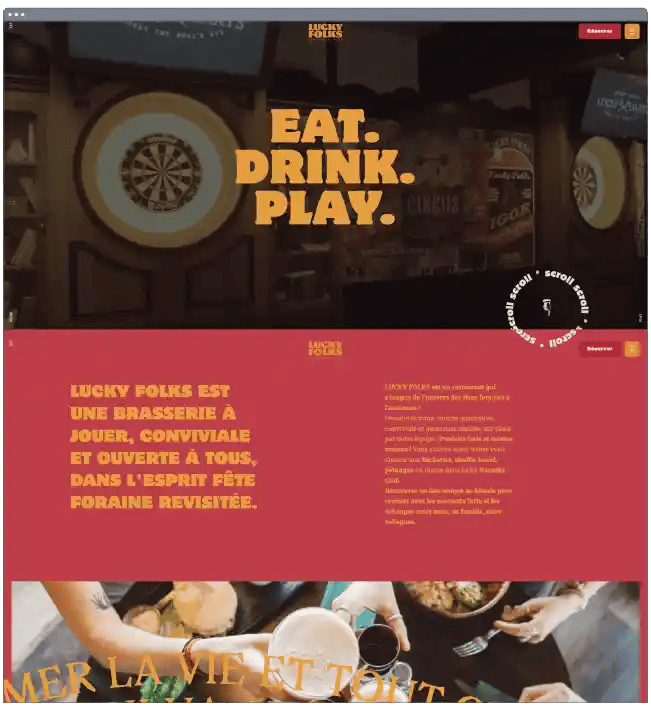
What we like: Lucky Folks both a restaurant and an entertainment destination. While enjoying your meal, you can indulge in bar games, dancing, and karaoke. It’s undeniably fun, a mood that its website seeks to replicate.
Lucky Folks throws pretty much everything at you design-wise: videos, animations, rich colors, and cursor effects just to name a few. Most effective, however, is the use of animated web textures in the background. This is a textbook example of how texture can immerse the user in a site’s atmosphere. In this case, the texture evokes the felt surface of a cards table.
8. Flaner
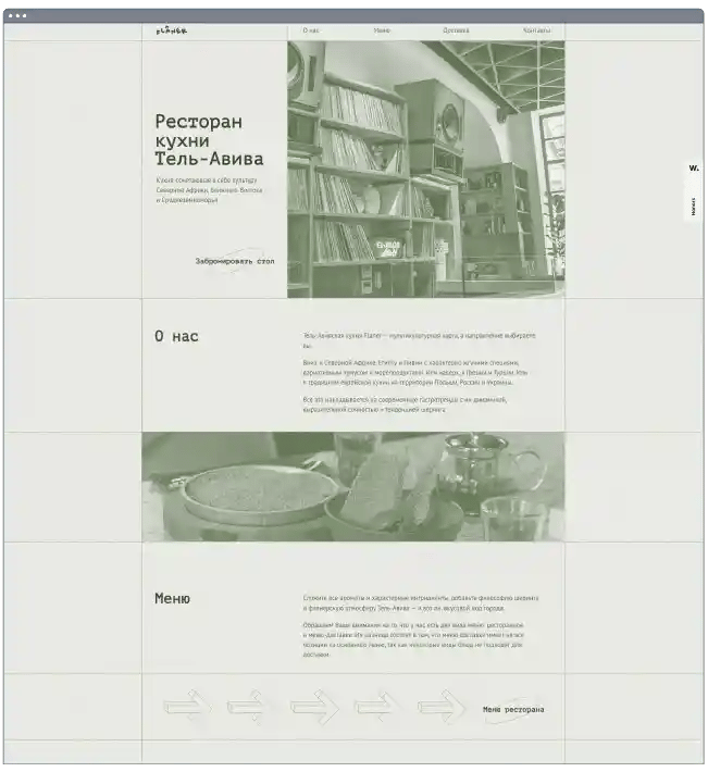
What we like: This website displays another superb use of texture to create a mood. This time, it’s animated static that mimics that of analogue speaker systems and vinyl records. The texture also pairs nicely with the site-wide green palette. When users hover over the images, color seeps in and brings them to life.
Another thing to note is that Flaner uses grids heavily on its pages, but not in a way that feels tired or generic. The clean lines that separate content into neat boxes aren’t something you see on many restaurant sites, and the whole thing is sure to leave an impression.
9. Back Door Donuts
.webp?width=651&height=710&name=restaurant-website-design_10%20(1).webp)
What we like: As a Massachusetts native, I want to book a ferry ticket after seeing the website for Martha’s-Vineyard-based doughnut shop Back Door Donuts. Maybe it’s the friendly and inviting images and copy, or the frosting drip effects, or maybe I just want a doughnut from somewhere other than Dunkin’.
The website’s designers know how tempting a bunch of high-res photos of doughnuts can be, but we like that this website goes beyond the food to highlight its history and place in the community.
10. Disco Cheetah
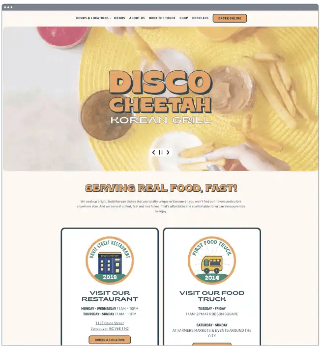
What we like: With what might be my favorite restaurant name on this list, Disco Cheetah serves up another impressive website built with BentoBox. This Canadian fast casual Korean grill creates bright, bold dishes with a website to match.
While this website doesn’t do anything particularly innovative with its design, it nails its aesthetic with rich colors and imagery, along with some clever illustrations and intuitive navigation.
11. Septime
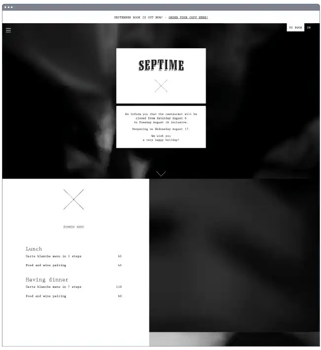
What we like: Let’s now return to Paris to check out the world-famous Septime, except here we care more about the homepage and less about the prestige. Septime’s website has a fascinating design: Instead of scrolling down past the video header, the video stays in place as you scroll, so it feels like you’re swiping the page contents up to you rather than moving down to them.
As far as page content goes, Septime gives only what you need to know: Menu, hours, contact info, and a wine list, all in black and white. It’s proof of a restaurant that knows its status and doesn’t need to prove anything else.
12. Abnormal Co.
What we like: This San Diego microbrewery prides itself on being “abnormal in every way.” We think this slogan extends to its website too, a unique experience defined by page content that slides into view as you scroll and a warm, dark aesthetic throughout.
Abnormal Co. also inserts multimedia to make an impression. There’s a video at the top of the homepage that users can watch to learn more, and some image sliders showcasing its collection of beers. The entire site shows this craft brewery also knows how to craft an online presence.
13. The Clove Club
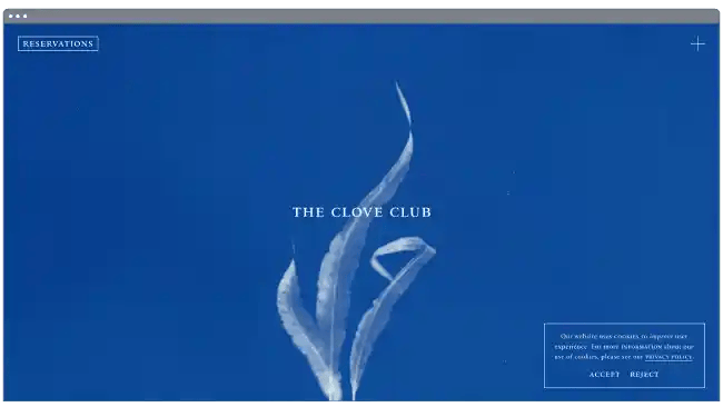
What we like: My personal favorite on this list, the Clove Club website is almost more beautiful than any site has the right to be. Its homepage feels cinematic with its sprouting plant animations, and the stripped back menu is one of the best, accessible by a “+” in the top corner.
We also appreciate the clear “reservations” option on the homepage that, when clicked, doesn’t take you to a separate booking website to grab your spot. You instead stay on the website, which makes the entire experience feel much more cohesive. A well-known establishment, the Clove Club knows that website visitors want in and makes it easy to get a table.
14. Pizzeria Vetri
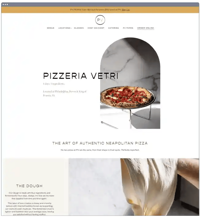
What we like: We couldn’t make this list without mentioning pizza at least once. Based out of Philadelphia, Pennsylvania, Pizzeria Vetri has one of our favorite pizza restaurant designs.
Pizzeria Vetri isn’t exactly reinventing the wheel (or, should I say, the pie) here. Rather, it’s a straightforward example of a website any restaurant owner can achieve, regardless of technical expertise.
15. Sweetgreen
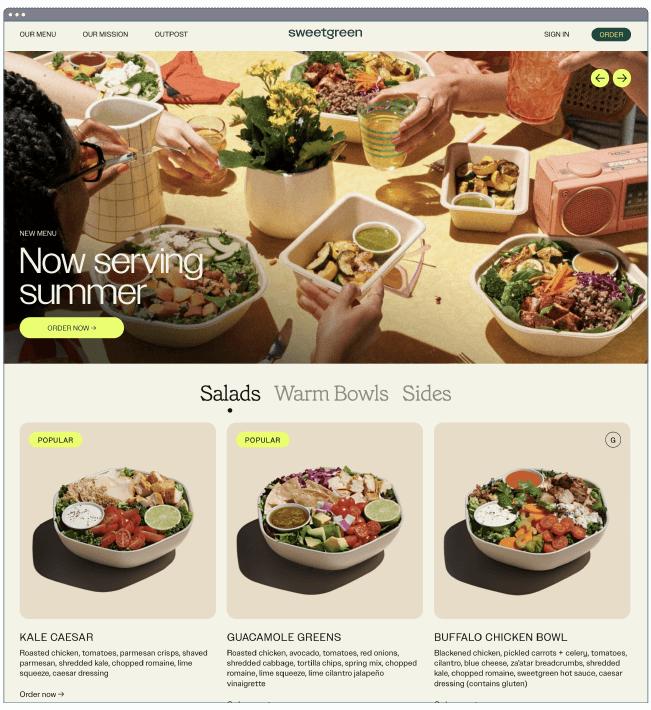
What we like: After looking at all of these pizza and doughnut websites, good luck getting me to eat a salad bowl. But if any website could pull it off, it’s Sweetgreen’s. The home page immediately hooks you in with its vivid and detailed photos that contrast nicely with the more muted color palette. Flavor is definitely at the forefront.
This website is also notable for incorporating short form video content into its homepage, showing how Sweetgreen experiments with new flavors and develops its recipes.
16. Hisa Franko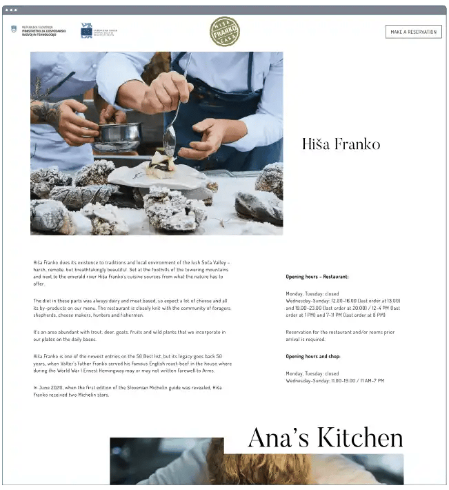
What we like: Nestled in the Soča Valley valley of Slovenia is Hisa Franko, helmed by the world-famous Ana Roš. Besides the hype surrounding this restaurant, its website does plenty of legwork convincing travelers to come through.
Like the dishes themselves, this website appears simple at first glance, but further inspection reveals the many elements that together build a cohesive and rewarding experience. The site introduces visitors to Hisa Franko’s story and style incrementally through quotes and outdoor photography — the whole site feels like a breath of fresh air.
17. Frantzén
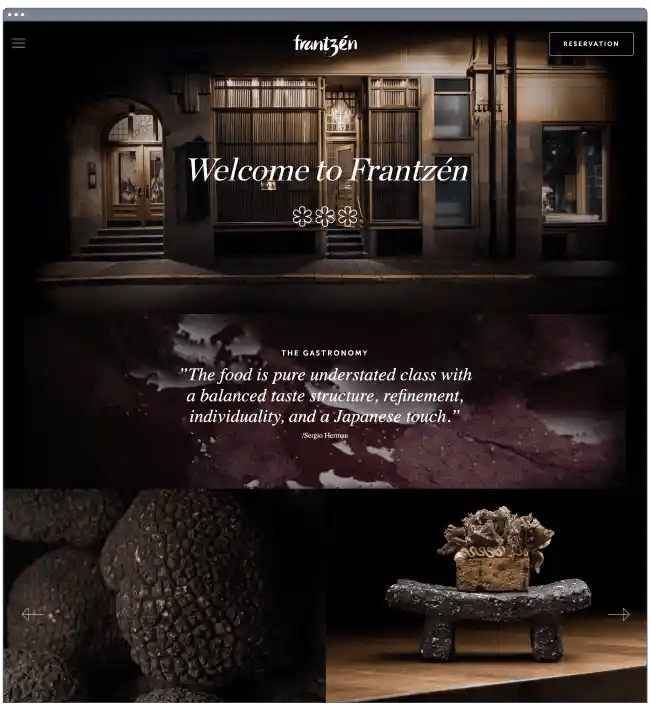
What we like: Frantzén creates a unique and immersive dining experience — instead of sitting a table, patrons tour the restaurant’s property while being served a course in each room. We think the restaurant’s website replicates this feeling well, drawing visitors into both the dishes and the space. Combining photos of dishes with images of the modern, low-lit spaces draws intrigue and dares you to book a reservation.
18. Laurie Raphaël
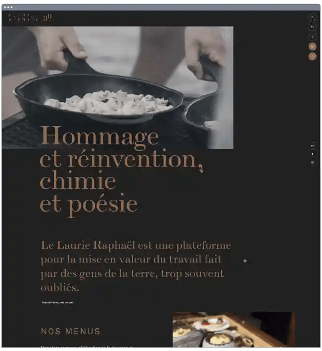
What we like: For its 30th anniversary, Quebec-based gastronomic restaurant Laurie Raphaël commissioned a new website that pays tribute to its past while looking to the future for inspiration.
The result is a masterful site that combines new and old design techniques. It features both broken and traditional grids, parallax scrolling, a mixture of fonts, and smooth animation effects applied to images as they scroll into view.
19. Sublime Doughnuts
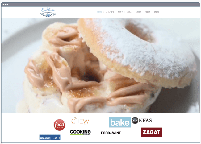
What we like: Another doughnut website? I know, but I just couldn’t resist. Plus, I have to give credit to a website that knows exactly what I want: Closeups of the perfect dessert-for-breakfast food, right on the homepage filling up the entire screen.
We also appreciate the photos of individual doughnuts that accompany every menu item. When picking out the perfect doughnut, you want the tastiest looking one. Sublime Doughnuts takes the joy of picking the pastry you want and puts it online.
20. Adachi
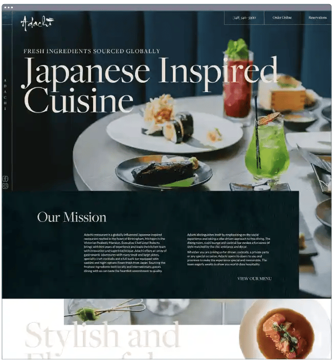
What we like: Adachi serves Japanese-inspired dishes, along with a website that puts them on full display. This site is packed with excellent use of photography, effects, and subtle touches that elevate it above competitors.
Take, for instance, the way the sticky header smoothly transitions from transparent to opaque when you begin to scroll down, or the image tiles near the bottom of the homepage that seem to hover above the background. Some might find these details superfluous, but we think they’re tasteful in moderation.
21. Rosebud
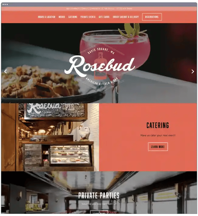
What we like: Here’s another website that, while it won’t blow you away with gimmicks or effects, makes up for it by getting straight to the point: American comfort food in a cozy setting.
Rosebud knows what it does well and tells you through full-width image sliders, cloth-like visual textures, and an on-point color scheme. The “Reservations” and “Email Signup” CTAs are also clear and visible wherever you are on the page.
22. Pastaria
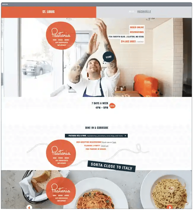
What we like: Fun and playful websites are always appreciated here, which is why we’ve included Pastaria as our final example. Highlights include the hero image with an enthusiastic dough tosser and the copy “St. Louis: Sorta close to Italy.”
Another nice touch is the navigation menu that sticks in place as you scroll downward, always available when you need it.
How to Design a Restaurant Website
- Get inspiration from website examples.
- Choose a CMS or website builder.
- Select a restaurant theme or template.
- Customize your design.
- Add a menu.
- Integrate an online ordering system.
- Optimize your website for mobile.
1. Get inspiration from website examples.
Before you begin looking for tools and website templates, you should look through website examples to inspire your own. You can look at similar types of restaurants to see how they designed their homepage, online menu, and more. You can look at local, popular restaurants to understand what color scheme, online ordering system, and other design elements might work well for your audience. You can also look at the latest web design trends to discover stylistic choices that might make sense for your website.
As you’re evaluating these website examples, consider writing down what you like and don’t like. Do you like how they incorporate images and videos? Their minimalist design? Use of parallax scrolling? These notes will help you begin planning out your own restaurant website design.
2. Choose a CMS or website builder.
Next, you’ll need to pick the software you want to use to build your restaurant website. When deciding, you’ll want to look at the out-of-the-box features, pre-designed templates, and extensions they offer.
You’ll likely need all, or most, of the functionality below:
- Menu builder or add-on
- Responsive and restaurant-specific templates
- Built-in online reservation system or extension
- Built-in online ordering system or extension
- Secure payment options
- Ecommerce store builder or extension
Having these features or add-ons will ensure you can create a custom design and menu with little to no coding, accept reservations and orders online, and have a marketplace where customers can order ingredients, meal boxes, merchandise, and more.
Wix, for example, offers a menu builder, professional templates, online order system, and secure payment options, among other features for restaurant websites specifically.

3. Select a restaurant theme or template.
A restaurant theme or template can help you easily change the look and feel of your site without having to code it from scratch. It will also have layouts and elements that are specifically suited for restaurant websites. For example, you may want a theme or template that has:
- clickable telephone links
- CTAs for reservations and online ordering on every page
- customizable text-based menus
- forms for catering and other inquiries
- multiple areas for location and contact information, including website footer
- image and video backgrounds
Ultimately, no one knows your restaurant better than you. Take the time to consider which theme or template would best represent your brand and most likely appeal to your customers.
The content management system or website builder you chose will likely have a directory of themes or templates, where you can use filters or the search bar to find ones related to your restaurant niche, with a specific layout, and more. If you can’t find one that you like, try a third-party marketplace like Themeforest.

4. Customize your design.
Not customizing a website template or theme is one of the biggest mistakes you can make when using a premade design. Without customizing it, you risk creating a restaurant website that looks like any other on the internet.
To capture your unique brand identity, you’ll want to do the following:
- add your logo
- change the color palette and font to match your branding
- replace the stock images with images of your restaurant, dishes, and customers
- update the placeholder copy
- upload your menu
- insert social media icons
- add personalized forms
- customize your navigation menus
- change the size, colors, and fonts of buttons
Below you can see some customization options for the title of a restaurant template in the popular WordPress page builder Elementor.

5. Add a menu.
A menu is one of — if not the most important part of a restaurant website. Your menu should be broken down into sections (like apps, entrees, and desserts), include prices, and have appealing descriptions that include terms your audience cares about like homemade or gluten-free. It should also use the same colors, fonts, and iconography as other pages on your site.
Depending on your theme and CMS or website builder, you’ll have different options for adding this menu. For some, you’ll create an individual menu page. For others, you’ll need a restaurant menu plugin. For others, you may need to embed a PDF.
Check out Toacabe’s menu, which shows what is available at each restaurant location, without requiring a PDF download.

6. Integrate an online ordering system.
According to data from Deloitte, 61% of consumers ordered takeout or delivery from restaurants at least once per week in 2021, an increase from 29% in 2020. In that same report, when considering the channel from which to order their food, 40% of consumers said they preferred to use a restaurant’s own branded website or app.
This underscores how impactful accepting online orders can be on your restaurant website. Depending on your CMS or website builder, you may need to install an extension or set up an integration with an online ordering system in another way.
Here’s an example of a restaurant website that’s integrated with Popmenu so users can place orders online and get them delivered or pick them up.

7. Optimize your website for mobile.
As people spend more time on mobile devices, having a mobile-friendly website is essential since many existing and prospective customers will view your restaurant website on mobile. Ensuring that they can place orders via their smartphones is also critical since mobile ordering offers convenience and speed, among other values.
Or you might consider converting your website into a mobile app instead. According to a study by PYMNTS of more than 4.3 million restaurant orders over 18 months, nearly 60% of digital orders were placed via a mobile app.
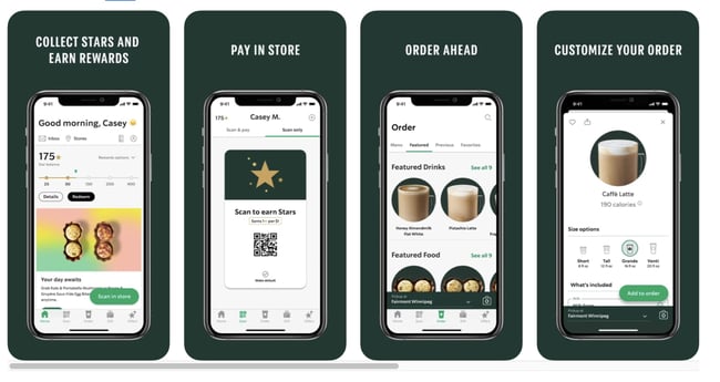
Starbucks is one of the most popular — and successful — mobile apps in the food and drink industry. In fact, almost a quarter of all transactions at Starbucks stores in the US were mobile orders through the company’s app in 2020.
The Best Restaurant Website Designs to Inspire Yours
From this list, we’ve sampled a lot of different flavors, from dark textures to vibrant palettes and minimalist to sensory overload. One thing these sites all have in common, however, is a foundation in UX principles. Each is crafted with the goal of helping you book a reservation or place an order.
So, take pointers from the examples you like, then combine them into something that’s truly your own. Given your experience in the kitchen, we assume you’re no stranger to the process.


![Artistic Web Design: Best Tips [+ 15 Examples We Love]](https://blog.hubspot.com/hubfs/artistic-web-design (1).png)


![10 Brochure Website Examples to Inspire You in 2022 [+ How to Make One]](https://blog.hubspot.com/hubfs/GettyImages-1306185043 copy.jpg)