Designer Michael Bierut has said that fonts are to written text what tone and accent are to your speech. Basically, fonts are your brand's voice. If you're choosing the HTML and CSS fonts you'll use on your website, what do you want your audience to hear?
Do you want the elegant tones of Optima or the trustworthy frankness of Baskerville? Is the neutral tone of Arial or quirkiness of American Typewriter a better fit for your brand?
Your website’s font is an important part of your marketing message.
It plays a crucial role in creating a unique brand identity. For instance, Facebook, Amazon, Disney, and Microsoft all have distinct fonts that set them apart. Most are custom-made and variations of existing fonts.
Not long ago, the same monotonous fonts appeared on almost every website, regardless of industry or brand. It was difficult to add unique fonts because there was no way to display them properly on all browsers.
Now there’s a greater variety of web-safe CSS and HTML fonts that you can use to aid your website development process and better brand your digital marketing efforts.
Keep reading to learn about the right web-safe fonts for your brand, or jump ahead with the links below.
- What are web-safe fonts?
- What are the different types of web fonts?
- Web-Safe Fonts for HTML and CSS
- Web-Safe HTML and CSS Fonts for Mac and iOS Devices
- Font Stacks
- Are web-safe fonts still necessary?
What are web-safe fonts?
Web-safe fonts are fonts that can adapt to any browser on any device. By using these types of fonts, web designers and developers ensure that the intended font will always display properly on a web page, even if these fonts aren’t installed on the user's computer.
Before web-safe fonts, if a user didn't have your particular website’s font installed on their computer, their browser would display a generic font as a backup, like Times New Roman.
As a result, marketers didn’t know how their web pages appeared to the end-user. If a page’s content doesn’t perfectly adapt to a different font, the user can run into functionality and design issues.
Free Guide: 25 HTML & CSS Coding Hacks
Tangible tips and coding templates from experts to help you code better and faster.
- Coding to Convention
- Being Browser-Friendly
- Minimizing Bugs
- Optimizing Performance
25 HTML & CSS Coding Hacks
Fill out the form to access your coding tips and templates.
Web-safe fonts solve this problem and are now a standard in web design. By choosing a web-safe font, you can be sure that your text will always appear as intended. Let's take a look at the different types of fonts.
What are the different types of web fonts?
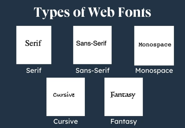
For web-safe fonts, you can use serif, sans-serif, monospace, cursive, fantasy, and MS fonts.
Serif
These fonts contain serifs — small decorative strokes that protrude from the main body of the letter. Serif fonts are easier to read in physical, printed formats, as the serifs lead the viewer’s eyes from character to character. Times New Roman is a serif font.
Sans-Serif
These fonts do not have serifs. Sans-serif fonts are easier to read on screens, so they are much more common in website copy. Arial is a sans-serif font.
Monospace
This term refers to fonts that have equal spacing between characters. Courier is a monospace font.
Cursive
These fonts resemble handwriting. Brush Script MT is a cursive font.
Fantasy
Fantasy fonts are highly stylized decorative fonts. Luminari is a fantasy font.
MS
The MS in font names stands for Microsoft. It shows that Microsoft created this font for its digital devices. Trebuchet MS is an example.

Free Guide: 25 HTML & CSS Coding Hacks
Tangible tips and coding templates from experts to help you code better and faster.
- Coding to Convention
- Being Browser-Friendly
- Minimizing Bugs
- Optimizing Performance
Let’s now go into some of the best web-safe fonts you can use.
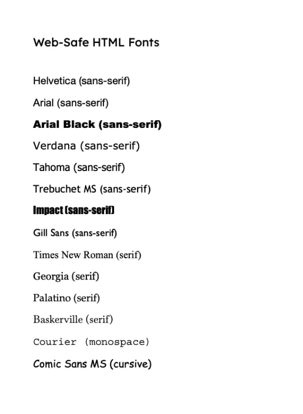
Web-Safe Fonts for HTML and CSS
- Helvetica (sans-serif)
- Arial (sans-serif)
- Arial Black (sans-serif)
- Verdana (sans-serif)
- Tahoma (sans-serif)
- Trebuchet MS (sans-serif)
- Impact (sans-serif)
- Gill Sans (sans-serif)
- Times New Roman (serif)
- Georgia (serif)
- Palatino (serif)
- Baskerville (serif)
- Andalé Mono (monospace)
- Courier (monospace)
- Lucida (monospace)
- Monaco (monospace)
- Bradley Hand (cursive)
- Brush Script MT (cursive)
- Luminari (fantasy)
- Comic Sans MS (cursive)
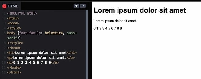
1. Helvetica (sans-serif)

Helvetica is one of the most popular and versatile fonts in the world. It's a neutral and simple sans-serif font that makes it easy to use in different scenarios and designs.
When to use this font: This font is popular for branding, signage, and online applications.
Why we like this HTML and CSS font:
- Elegant and clean look
- Easy to read
- Minimalist feel
- Neutral
2. Arial (sans-serif)
.webp?width=650&height=119&name=arial%20(1).webp)
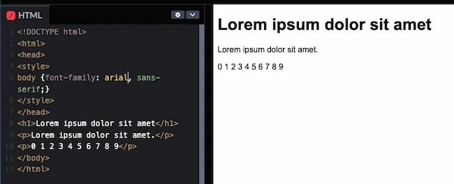
Arial is the most widely used sans-serif font on the web. Made for printers who wanted to use the popular Helvetica font without the licensing fees, it looks and feels similar.
Many consider Arial and members of the Arial font family the safest web fonts because they’re available on all major operating systems.
When to use this font:
This font is popular for all types of online media. You'll see it in reports, presentations, logos, brochures, blogs, and advertising.
Why we like this HTML and CSS font:
- Clean
- Industrial and professional look
- Neutral
- Easy to read
- Good for long blocks of text
3. Arial Black (sans-serif)

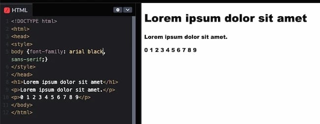
Arial Black is another related font in the Arial family. It's a bold version more suitable for headers, decorative text, and emphasized text. However, its prominence means designers should use it strategically and carefully.
When to use this font:
This font is great for white papers, case studies, and other promotional projects. It's also popular for advertising, ebooks, and business sites.
Why we like this HTML and CSS font:
- Versatile
- Bold
- Good for headers and decorative text
- Clean and minimal
Note: This font may not display on iOS or Android devices.
4. Verdana (sans-serif)

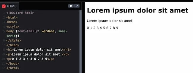
Verdana is popular both online and off. While it resembles Arial and Helvetica, it has a simple structure that makes the letters large and clear. Some of its characters have elongated lines, which may be incompatible with some designs. Otherwise, it's a solid alternative to Arial.
When to use this font:
This font is ideal for when you need to put a lot of text in a small space, like in blog posts. It's also very readable, even at small point sizes.
Why we like this HTML and CSS font:
- Great for mobile and other small-screen devices
- Good for large blocks of text
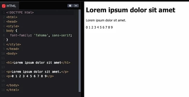
5. Tahoma (sans-serif)

Like Verdana, the Tahoma font sports a bolder weight and narrower tracking (less space between characters). It's often used as an alternative to Arial.
When to use this font:
This font is great for mobile apps, websites, and other onscreen use cases.
Why we like this HTML and CSS font:
- Created for screens
- Easy to read, even at small sizes
- Flexible
- Good for email
Note: This font may not display on iOS devices.
6. Trebuchet MS (sans-serif)

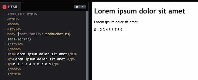
Trebuchet MS is another web-safe sans-serif font, designed by the Microsoft Corporation in 1996. It’s commonly used for the body copy of many websites and can be a solid alternative to your site’s sans-serif font. It also may not look as "basic" as Arial.
When to use this font:
This font is popular for spreadsheets, websites, and instructions online. Its friendly look also makes Trebuchet MS common in marketing.
Why we like this HTML and CSS font:
- Easy to read
- Distinct look
Note: This font may not display on Android devices.
7. Impact (sans-serif)

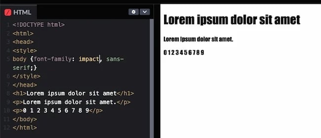
Impact is a heavy sans-serif font great for drawing attention and creating … well, impact. It’s also notable for being a particularly narrow font. Its characters have a higher width-to-height ratio than other comparable fonts.
Impact was first introduced to digital devices in Microsoft Windows in 1998. Since then it's seen a resurgence in popularity in internet memes, superimposed atop images for a humorous effect.
When to use this font:
Use this font to attract attention, usually in headlines or handouts.
Why we like this HTML and CSS font:
- Bold and blocky
- Popular meme font
- Commands attention
Note: This font may not display on iOS or Android devices.
8. Gill Sans (sans-serif)
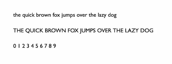
Monotype released Gill Sans in 1928. This font blends classic and modern influences to create a simple and clean typeface for both print and digital use.
When to use this font: This font works for most applications, including body copy, branding, and headlines.
Why we like this HTML and CSS font:
- Neutral
- Easy to read
- Modern and classic
Note: This font may not display on Android devices.
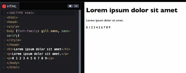
9. Times New Roman (serif)

Times New Roman is the ultimate serif font. It's extremely popular and the primary font for Windows devices and applications, like Microsoft Word. Browsers often revert to it when they can't display the specified serif font.
Technically, Times New Roman is an updated version of the Times newspaper font, which is used in print newspapers and, as a result, is one of the most recognizable fonts in the world.
When to use this font:
This font is good for large blocks of text and is familiar to most viewers because of its use in publishing. This also makes it a good font choice for websites where visitors may want to print out pages to read later.
Why we like this HTML and CSS font:
- Timeless
- Best for page titles, headings, and subheadings online
- Grand and classic look
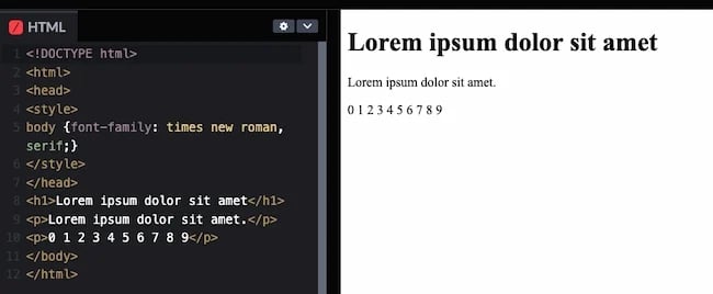
10. Georgia (serif)

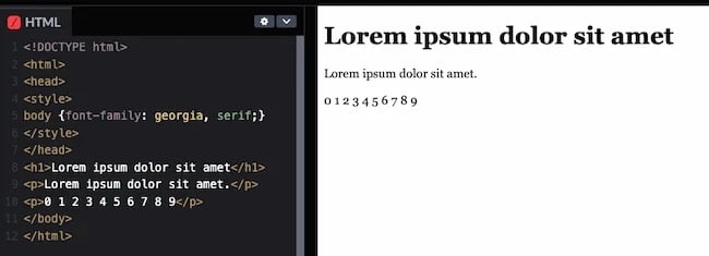
Georgia is another elegant serif font. It was designed to be more readable at different font sizes than other serif fonts. It accomplishes this with a heavier weight, making it an ideal candidate for mobile-responsive design.
When to use this font:
This font is easy to read on-screen, making it ideal for blogs and body copy. It’s often used in newspapers and other online publications.
Why we like this HTML and CSS font:
- Readable on screen, even at small sizes
- Charming and modern
- Good for headlines

Free Guide: 25 HTML & CSS Coding Hacks
Tangible tips and coding templates from experts to help you code better and faster.
- Coding to Convention
- Being Browser-Friendly
- Minimizing Bugs
- Optimizing Performance
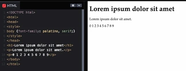
11. Palatino (serif)

Hermann Zapf designed the old-style Palatino font in 1949. It was initially used in book publishing and is now popular in all online applications. This is in part because its wide structure and openness make it easy to read at a distance.
When to use this font: Palatino is a good font for headings, ads, and body copy. It's also a popular font for branding.
Why we like this HTML and CSS font:
- Easy to read on screen
- Good at small sizes
12. Baskerville (serif)

Baskerville has been around since the 1940s and strikes a balance between classic and modern styles. Originally a font for quality book-making, Baskerville has gone through several updates for digital use.
When to use this font: This font is good for business and agency websites that need to create an aura of establishment and trust.
Why we like this HTML and CSS font:
- Professional
- Easy to read on screens
.webp?width=650&height=262&name=baskerville-code%20(2).webp)
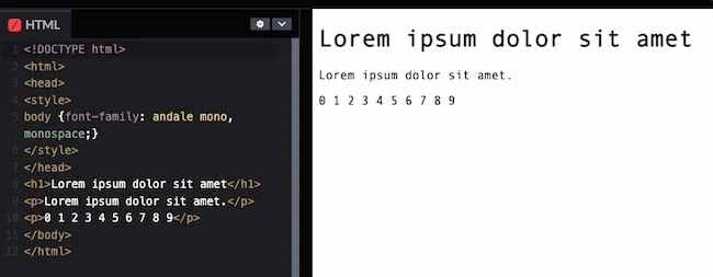
13. Andalé Mono (monospace)

Evenly-spaced letters are a feature of all monospaced fonts. This lends a mechanical quality to the text.
Andalé Mono is a perfect example of a monospace font. Apple and IBM developed this sans-serif font and it's often used in software development environments.
When to use this font:
This font is useful for software development, so it could be a good font if you are building a technology-focused site.
Why we like this HTML and CSS font:
- Consistent looking
- Clean
Note: This font may not display on iOS, Windows, or Android devices.
14. Courier (monospace)

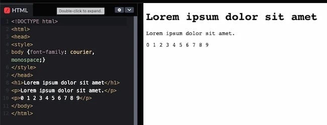
Courier is a monospace serif font that closely resembles typewriter text. Many email providers use it as their default font. It's also widely used with coding application displays.
Note that the font Courier New is in the same family as Courier. You can list Courier after Courier New in your font stack to offer two different, but similar, options to the browser.
When to use this font: This font is great for reports and technical documentation, and it's popular in the legal and tech industries. It's also a standard font for screenwriting.
Why we like this HTML and CSS font:
- Rare on websites
- Good for email
- Easy to read
15. Lucida Console (monospace)

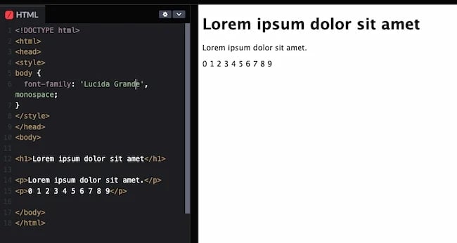
Lucida Console was designed to be a highly legible monospaced iteration of the broader Lucida typeface. It’s monospace but resembles human handwriting more than other monospace choices we’ve covered, so it looks less mechanical.
When to use this font:
This font is popular in Windows operating systems and applications. If you are creating something new, this is a simple font that will feel familiar to your audience.
Why we like this HTML and CSS font:
- Simple and clear
- Takes up less space than other similar fonts
Note: This font may not display on iOS or Android devices.
16. Monaco (monospace)

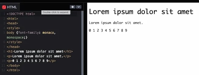
The monospace sans-serif Monaco font is native to macOS and will be more familiar to Apple users as a result.
When to use this font: This font is simple but has some unique characters. It's great for landing pages, pop-ups, and when you want to draw attention. This font is also popular on gaming and coding sites.
Why we like this HTML and CSS font:
- Clean
- Distinct
- Draws attention
Note: This font may not display on iOS, Windows, or Android devices.
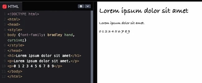
17. Bradley Hand (cursive)

Based on designer Richard Bradley's handwriting, this calligraphic typeface evokes a casual, personal quality. It’s ideal for use in headings, decorative text, and short bodies of text.
When to use this font: This font is popular in advertising and branding. It's also good for brands that want to make their website or email copy feel more casual or personal.
Why we like this HTML and CSS font:
- Easy to read, even at small sizes
- Handwriting look
Note: This font may not display on Android devices.
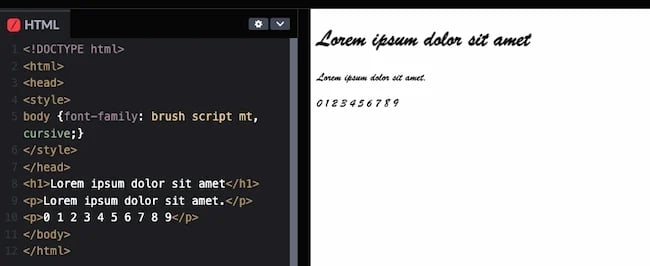
18. Brush Script MT (cursive)

Brush Script MT is a heavily embellished script font designed to mimic quick handwritten strokes. While it can evoke nostalgia in some readers, it’s best to limit this font to decorative uses, as its style comes at the cost of legibility.
When to use this font: When you want your website to feel more personal this font is another option. It's also often used in posters and signage.
Why we like this HTML and CSS font:
- Versatile
- Nostalgic
- Mimics cursive handwriting
- More formal than Bradley Hand
Note: This font may not display on iOS or Android devices.
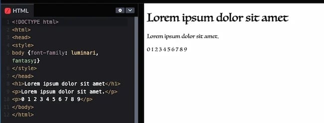
19. Luminari (fantasy)

Fantasy fonts are typically decorative and best used in headlines that only contain a few words. Luminari is a decorative font with a medieval quality. Use it to add a Gothic essence to your web pages.
When to use this font: This font is popular for wedding websites, greeting cards, and branding. It has a whimsical Gothic quality that may be hard to read in body copy but works well in headlines and subheadings.
Why we like this HTML and CSS font:
- Whimsical
- Nostalgic
Note: This font may not display on iOS, Windows, or Android devices.
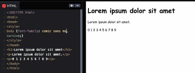
20. Comic Sans MS (cursive)

At last, we arrive at the font that everyone likes to poke fun at, Comic Sans. Designed to imitate the style of lettering found in comic books, Comic Sans MS feels informal and fun. It's also been the target of many internet jokes.
Still, Comic Sans is useful for accessibility reasons. Because it lacks similar letterforms like p/q and b/d, people with dyslexia tend to experience less difficulty with it than with commonplace fonts.
When to use this font: This font is great for brands that focus on fun, like resources for young children.
Why we like this HTML and CSS font:
- Easy to read
- Casual
Note: This font may not display on iOS or Android devices.
Web-Safe HTML and CSS Fonts for Mac and iOS Devices
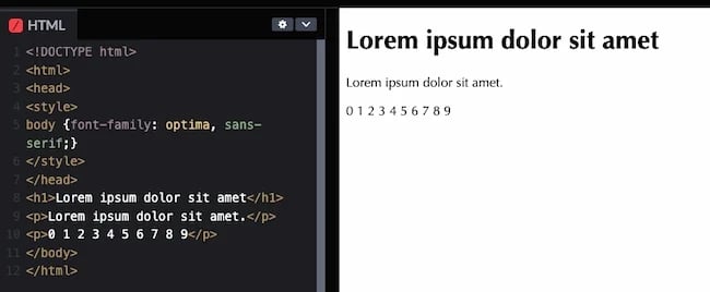
21. Optima (sans-serif)

Optima is another versatile and elegant font. Its clean and classic look makes it especially popular in beauty niches.
When to use this font: Whether you're creating a blog, landing page, ebook, or store signage, this font is useful and versatile.
Why we like this HTML and CSS font:
- Elegant
- Classic
- Clean
- Versatile
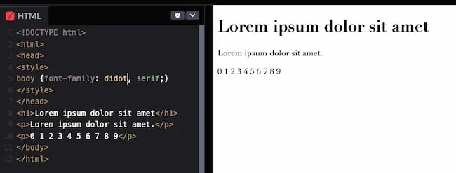
22. Didot (serif)

This old French typeface was originally used for printing presses. It’s notable for its elegant aesthetic and can add a formal quality to your copy.
When to use this font: Many modern and luxury brands use this font in their logos and other materials. This font is good on websites because it’s easy to read at low resolution.
Why we like this HTML and CSS font:
- Good for headers and taglines
- Elegant
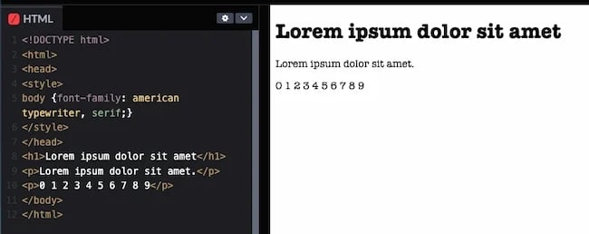
23. American Typewriter (serif)

If you want to invoke a classic, nostalgic quality with your text, this is an ideal font to do it. American Typewriter imitates typewriter print and works well for stylized body text.
When to use this font: This font is good for branding, headlines, and adding flair to your website pages.
Why we like this HTML and CSS font:
- Easy to read
- Versatile
- Distinct
Web-Safe HTML Fonts: Try It Yourself
Now it's your turn! Use the code modules below to try your hand at playing with web-safe HTML fonts. The below code snippets contain inline CSS as opposed to regular CSS in a separate document. For that reason, the syntax looks like this:
<body style="font-family: 'Verdana', sans-serif;">
As opposed to:
body { font-family: Verdana, sans-serif }
Keep your specific use case in mind when changing HTML fonts.
Try It Out: Serif HTML Fonts
The code module below is editable. Simply edit the HTML code and click rerun in the bottom right-hand corner.
See the Pen Web Safe HTML & CSS Fonts: Try It Yourself by HubSpot.
Here are a few serif fonts you can insert via inline CSS:
- Times New Roman: font-family: 'Times New Roman', serif;
- Georgia: font-family: 'Georgia', serif;
- Palatino: font-family: 'Palatino', serif;
- Baskerville: font-family: 'Baskerville', serif;
Try It Out: Sans-Serif HTML Fonts
The code module below is editable. Simply edit the HTML code and click rerun in the bottom right-hand corner.
See the Pen Web Safe HTML & CSS Fonts: Try It Yourself (Sans-Serif) by HubSpot.
Here are a few sans-serif fonts you can insert via inline CSS:
- Helvetica: font-family: 'Helvetica', sans-serif;
- Arial: font-family: 'Arial', sans-serif;
- Arial Black: font-family: 'Arial Black', sans-serif;
- Verdana: font-family: 'Verdana', sans-serif;
- Tahoma: font-family: 'Tahoma', sans-serif;
- Trebuchet MS: font-family: 'Trebuchet MS', sans-serif;
- Impact: font-family: 'Impact', sans-serif;
- Gill Sans: font-family: 'Gill Sans', sans-serif;
Try It Out: Monospace HTML Fonts
The code module below is editable. Simply edit the HTML code and click rerun in the bottom right-hand corner.
See the Pen Web Safe HTML & CSS Fonts: Try It Yourself (Monospace)
Here are a few monospace fonts you can insert via inline CSS:
- Andalé Mono: font-family: 'Andalé Mono', monospace;
- Courier: font-family: 'Courier', monospace;
- Lucida: font-family: 'Lucida', monospace;
- Monaco: font-family: 'Monaco', monospace;
Try It Out: Cursive & Fantasy HTML Fonts
The code module below is editable. Simply edit the HTML code and click rerun in the bottom right-hand corner.
See the Pen Web Safe HTML & CSS Fonts: Try It Yourself (Cursive & Fantasy) by HubSpot.
Here are a few cursive and fantasy fonts you can insert via inline CSS:
- Bradley Hand: font-family: 'Bradley Hand', cursive;
- Brush Script MT: font-family: 'Brush Script MT', cursive;
- Luminari: font-family: 'Luminari', fantasy;
- Comic Sans MS: font-family: 'Comic Sans MS', cursive;
As you scanned these web-safe fonts you may have noticed some exceptions for usage. You may also have a font you already love and are using for your brand that isn't on this list.
How do you think your audience will feel once they get comfortable with your chosen font, then that experience abruptly changes when they're online? Maybe a long-time customer usually scans your site at home on their laptop. Every time they log in, they see the elegant lines of the serif font Didot.
But one day they want to show a friend your site on their Android, and sans-serif Arial pops up instead. Will they still feel the same about your site and your products?
These are important decisions to make as you think about web-safe fonts. This is where font stacks come in.

Free Guide: 25 HTML & CSS Coding Hacks
Tangible tips and coding templates from experts to help you code better and faster.
- Coding to Convention
- Being Browser-Friendly
- Minimizing Bugs
- Optimizing Performance
Font Stacks
CSS font stacks allow you to give several font backups to the browser. And they’re not just backups in case of technical or server failures, either. For example, consider a user who dislikes the system’s default font and deletes it from their operating system. You can’t control that, so it’s better to be safe.
To address this problem, CSS allows you to add a list of similar backup fonts in a font stack. A font stack improves your site’s universal compatibility with different browsers and operating systems. If the first font doesn’t work, the browser will try the next one in the stack, and so on.
To make a font stack, add several related font names to the font-family property. Order your fonts by priority — the font you want most should appear first, and a generic font family should end the list. Here’s an example:
p { font-family: "Playfair Display", "Didot", "Times New Roman", Times, serif; }
These are all serif fonts, ensuring the experience stays consistent. Or you can use another type of font across your font stack.
Do I need to download web-safe fonts to use them in a font stack?
No. Because these fonts are web-safe, there’s no need to download a font file. When you specify these fonts in your font stack, your browser will quickly recognize the font that you’re referring to and show it to your site visitor.
Learn More: The Beginner's Guide to HTML & CSS
Want to learn more about HTML? Download our free guide for best practices for getting started with HTML.
With so many advances in web design, it’s easy to wonder whether web-safe fonts are obsolete or whether font stacks are too complicated. After all, we now have AI bots and a dedicated framework for designing mobile pages. Surely a technology exists that makes all fonts web-safe.
But this is simply not true. Let’s discuss why web-safe fonts are still important today.
Are web-safe fonts still necessary?
Yes, web-safe fonts are still necessary. They’re the only fonts that will consistently show in all browsers regardless of a user’s geographical location, internet bandwidth, browser settings, or device.
You might have chosen the most beautiful font from Google Fonts. But if you don’t pair it with a web-safe font in your CSS font stack, you risk rendering text that looks off-brand on your site.
Here are a few more reasons why you’ll want to use web-safe fonts.
1. Your HTML text will stay consistent.
If you use a sans-serif font on your website, you’ll want to choose a web-safe sans-serif font as a backup.
For example, HubSpot’s site would look strange with a serif font, because we only use sans-serif typefaces on our pages. If you come across the HubSpot site in Verdana, the change won’t be as jarring.
It’s also important to give the browser a few font backups for unique characters. Consider the registered symbol (®). If your preferred font doesn’t support this symbol, but the next one in your font stack does, you can ensure that the symbol looks similar to the original font.
2. The browser will have several choices before it defaults to its preferred web font.
All browsers have a default font they’ll display if, for some reason, they can’t load your website’s font file. You can delay this process by using a series of web-safe fonts in your font stack.
This will allow your font to "degrade gracefully." Instead of switching from Playfair Display straight to Times New Roman, the font can go from Playfair Display to Didot, a much closer alternative. If Didot isn’t available, then the font can switch to Georgia, and last, to the default serif font the browser uses.

3. You’ll have several backups if you’re using a self-hosted font.
Nowadays, you can easily connect to Google Fonts and use a font that’s accepted by most browsers. You’ll rarely find a page written in Open Sans that doesn’t display in Open Sans.
But if you uploaded a custom font to your site’s hosted files, compatibility isn’t guaranteed. Your web server might go down momentarily, or the end user’s browser might not support that specific font.
You can rest easy if you add web-safe fonts to your font stack. This will ensure that your font degrades in steps. This is better for your audience than a harsh jump to the browser’s web-safe font.
Use Web-Safe CSS and HTML Fonts for Your Designs
Font selection might seem nit-picky, but it’s no small detail. Choosing the right text style ensures that your message highlights your brand voice and positively impacts your website campaigns.
Keep learning, and stay aware of how your fonts appear on different browsers and devices. Before you publish your website, make sure to test your font stack on various browsers to ensure compatibility, and use fallback fonts when necessary. With the right fonts, you can make your brand voice sing.
Editor's note: This post was originally published in March 2020 and has been updated for comprehensiveness.

Free Guide: 25 HTML & CSS Coding Hacks
Tangible tips and coding templates from experts to help you code better and faster.
- Coding to Convention
- Being Browser-Friendly
- Minimizing Bugs
- Optimizing Performance
![Download Now: 25 HTML & CSS Hacks [Free Guide]](https://no-cache.hubspot.com/cta/default/53/848be230-f06a-420e-9a24-82b45fe61632.png)


![How to Convert Your Website Into an App [+ 5 Brands That Did It]](https://blog.hubspot.com/hubfs/how-to-convert-website-into-mobile-app.jpg)